Introduction
T for Turbo? According to OnePlus, the T in OnePlus 6T doesn't really stand for anything. But since it's the next letter after S it's just a cheeky way to sort of one-up what many companies (cough, Apple, cough) have been using to denominate devices that are marginally different. So what do you get in the 6T that you didn't in the OnePlus 6? It's not more performance, because they're both powered by the same chip.There's a smaller, nicer looking and less intrusive notch, for one. More base storage (that comes along with an increased price), and a slightly larger screen area. Oh, and an in-display fingerprint sensor. Whether that was enough to sway you towards the OnePlus 6T when it came out last year is up for debate, but OnePlus' business model means that it usually strives to offer only one model at a time. So think of the 6T as an improved version of the 6.
Now let's get to the meat of the issue. The OnePlus 6T has been out for months at this point, and we've been using it for a very long time in this period. So what better to do than write our impressions about what it's been like living with it day in and day out? Hence, this long-term review was born. As soon as the Oneplus 7 is out, you will have a limited opportunity window of snatching the OnePlus 6T at a discounted price so there is that as well.
While Huawei and Samsung do have two big phone launches each year, those are of different families - the P series and the Mate series, the S line and the Note line, respectively, and each have some unique selling points they keep in the family (although Huawei has recently started to stray from that philosophy a bit with the P30/Pro).
 On the other hand, OnePlus is more akin to Sony's past antics in
launching two high-end flagships each year that are pretty similar to
each other, and this might create some angst among buyers of any OnePlus
handset when the new one comes along just a few short months later.
On the other hand, OnePlus is more akin to Sony's past antics in
launching two high-end flagships each year that are pretty similar to
each other, and this might create some angst among buyers of any OnePlus
handset when the new one comes along just a few short months later.However, it makes little sense buying a OnePlus 6 and then switching to the 6T (or 5/5T, etc), specifically because of the minute differences involved. Then again, even if you were to do this, the financial hit you're taking is a lot smaller than if you were to purchase two higher priced phones each year. So does this mean OnePlus has nailed a 'best of both worlds' scenario, where it can update its flagship line quickly without losing frustrated customers in the process? Maybe.
While we'll touch upon that a bit in this long-term review, its purpose is more to show you how the OnePlus 6T behaved in day to day use and how it's 'aged' so far, now that we're getting very close to the release of its successor (or successors, if we go by the rumor mill). So join us on the next few pages as we try to help you ascertain whether it would be a good buy once the new models are out.
Design, build, handling
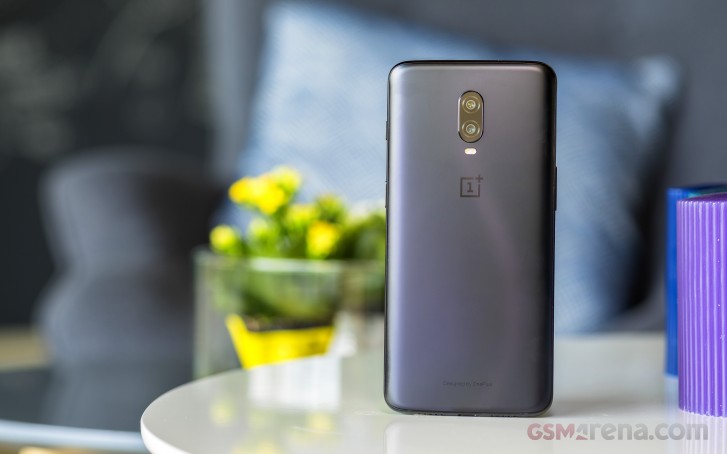
The OnePlus 6T is eerily similar to the OnePlus 6 when it comes to looks, with a few important differences. There's no more fingerprint sensor on the back, which gives that side of the phone a cleaner look, but it's so clean that, dare we say it, it looks quite bland.Pair that with OnePlus' seeming disagreement with the concept of having myriad color options, and what most people buying a 6T will end up with is a handset that's either black or black. Sure, you can pick between a mirror-like finish and a matte-ish one, but at the end of the day it's still glass and it's still black.
 The glass rear panel means the phone is slippery, and while that's
less of an issue on the matte option than the mirror one, don't expect
any huge amounts of grip. The matte version does have an interesting
feel in the hand, but not as much as the Huawei Mate 20 Pro in green or
blue, with its micro texture.
The glass rear panel means the phone is slippery, and while that's
less of an issue on the matte option than the mirror one, don't expect
any huge amounts of grip. The matte version does have an interesting
feel in the hand, but not as much as the Huawei Mate 20 Pro in green or
blue, with its micro texture.OnePlus has so far been resisting going all-in with gradients, even though a big part of the mobile world has embraced those, so you probably shouldn't expect wild color options to arrive in the future. The 6T got Thunder Purple, but it's much more subdued than the name implies, and that's pretty much the only non-black option there ever was.
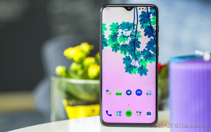
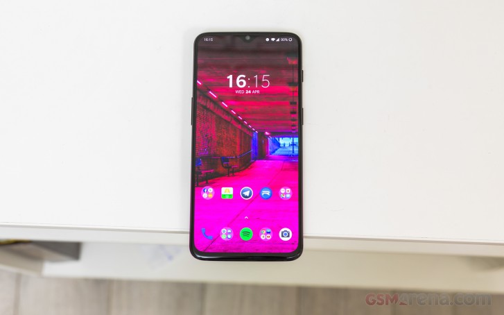
On the front the 6T gets a much easier to live with notch than the 6 - both in size as well as in shape. The water drop design is simply more aesthetically pleasing to look at than the OnePlus 6's notch shape, and because of that we surprised ourselves by not employing the notch hiding setting while we've used the 6T. Sure, there was an adjustment period necessary, but this was incredibly short. After that, even when we did notice the notch, it wasn't bad to look at, it was just... there.
 An ever so slight improvement in usability came along with the new
notch, and that is because the proximity sensor seems to work much
better in the 6T than in the 6, and that's probably due to its
placement, with it being more centered below the earpiece now. We've had
some issues with this sensor during our time with the OnePlus 6, as our
long-term review of that model can attest, but we're happy to report
that most of the time it's been fine in the 6T.
An ever so slight improvement in usability came along with the new
notch, and that is because the proximity sensor seems to work much
better in the 6T than in the 6, and that's probably due to its
placement, with it being more centered below the earpiece now. We've had
some issues with this sensor during our time with the OnePlus 6, as our
long-term review of that model can attest, but we're happy to report
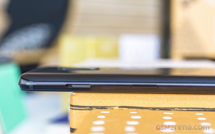
that most of the time it's been fine in the 6T.The alert slider is still unique to OnePlus in the Android world and we still don't understand why. It's such a small thing, yes, but it's one of those that significantly aids usability multiple times a day. It's easy to get used to and very easy to miss if you switch to another device. Its three positions cover the entire range of what we expect, alert-wise - sound on, vibrate, and complete silence - and we found it very useful.
 The bottom bezel has shrunk somewhat compared to the OnePlus 6, but
unless you have a magnifying glass you're unlikely to really notice. The
build quality is great and it matches up nicely with the high-end specs
inside. Handling the OnePlus 6T is okay, but at the verge of what we'd
call comfortable. Its screen is wide, and it's long, and operating the
phone with one hand is fine, but had the display been any longer or
wider we wouldn't have said that - and keep in mind that this reviewer
does not have small hands at all.
The bottom bezel has shrunk somewhat compared to the OnePlus 6, but
unless you have a magnifying glass you're unlikely to really notice. The
build quality is great and it matches up nicely with the high-end specs
inside. Handling the OnePlus 6T is okay, but at the verge of what we'd
call comfortable. Its screen is wide, and it's long, and operating the
phone with one hand is fine, but had the display been any longer or
wider we wouldn't have said that - and keep in mind that this reviewer
does not have small hands at all.For people with smaller hands, this could be one of those two-hand devices, unfortunately, so keep that in mind. The screen-to-body ratio is nice (and would've been unheard of in the mobile world just a couple or so years ago), but we feel that screen sizes need to stop growing now. The entire point of cutting bezels left and right (and top, and bottom) was so that companies could fit more screen into the same phone size, but when you forget that and start to amp up the overall size of a handset too, you quickly reach a plateau where a lot of people would feel uncomfortable using it for an extended period of time. Or maybe that's on purpose, like a hardware version of Apple's and Google's software settings meant to control your screen time?
Anyway, we digress. The OnePlus 6T is very well built, comfortable enough to use (if you don't have small hands), and it looks... fine. It's not exciting in any way when it comes to design, though, the company has definitely been playing it safe in this space. So if you're the type to want a phone that does innovative (or just plain crazy) things with its design, this is certainly not it. Read on, however, for you might find it has some redeeming features in the end.
Design, build, handling
The OnePlus 6T is eerily similar to the OnePlus 6 when it comes to looks, with a few important differences. There's no more fingerprint sensor on the back, which gives that side of the phone a cleaner look, but it's so clean that, dare we say it, it looks quite bland.Pair that with OnePlus' seeming disagreement with the concept of having myriad color options, and what most people buying a 6T will end up with is a handset that's either black or black. Sure, you can pick between a mirror-like finish and a matte-ish one, but at the end of the day it's still glass and it's still black.
 The glass rear panel means the phone is slippery, and while that's
less of an issue on the matte option than the mirror one, don't expect
any huge amounts of grip. The matte version does have an interesting
feel in the hand, but not as much as the Huawei Mate 20 Pro in green or
blue, with its micro texture.
The glass rear panel means the phone is slippery, and while that's
less of an issue on the matte option than the mirror one, don't expect
any huge amounts of grip. The matte version does have an interesting
feel in the hand, but not as much as the Huawei Mate 20 Pro in green or
blue, with its micro texture.OnePlus has so far been resisting going all-in with gradients, even though a big part of the mobile world has embraced those, so you probably shouldn't expect wild color options to arrive in the future. The 6T got Thunder Purple, but it's much more subdued than the name implies, and that's pretty much the only non-black option there ever was.
On the front the 6T gets a much easier to live with notch than the 6 - both in size as well as in shape. The water drop design is simply more aesthetically pleasing to look at than the OnePlus 6's notch shape, and because of that we surprised ourselves by not employing the notch hiding setting while we've used the 6T. Sure, there was an adjustment period necessary, but this was incredibly short. After that, even when we did notice the notch, it wasn't bad to look at, it was just... there.
 An ever so slight improvement in usability came along with the new
notch, and that is because the proximity sensor seems to work much
better in the 6T than in the 6, and that's probably due to its
placement, with it being more centered below the earpiece now. We've had
some issues with this sensor during our time with the OnePlus 6, as our
long-term review of that model can attest, but we're happy to report
that most of the time it's been fine in the 6T.
An ever so slight improvement in usability came along with the new
notch, and that is because the proximity sensor seems to work much
better in the 6T than in the 6, and that's probably due to its
placement, with it being more centered below the earpiece now. We've had
some issues with this sensor during our time with the OnePlus 6, as our
long-term review of that model can attest, but we're happy to report
that most of the time it's been fine in the 6T.The alert slider is still unique to OnePlus in the Android world and we still don't understand why. It's such a small thing, yes, but it's one of those that significantly aids usability multiple times a day. It's easy to get used to and very easy to miss if you switch to another device. Its three positions cover the entire range of what we expect, alert-wise - sound on, vibrate, and complete silence - and we found it very useful.
 The bottom bezel has shrunk somewhat compared to the OnePlus 6, but
unless you have a magnifying glass you're unlikely to really notice. The
build quality is great and it matches up nicely with the high-end specs
inside. Handling the OnePlus 6T is okay, but at the verge of what we'd
call comfortable. Its screen is wide, and it's long, and operating the
phone with one hand is fine, but had the display been any longer or
wider we wouldn't have said that - and keep in mind that this reviewer
does not have small hands at all.
The bottom bezel has shrunk somewhat compared to the OnePlus 6, but
unless you have a magnifying glass you're unlikely to really notice. The
build quality is great and it matches up nicely with the high-end specs
inside. Handling the OnePlus 6T is okay, but at the verge of what we'd
call comfortable. Its screen is wide, and it's long, and operating the
phone with one hand is fine, but had the display been any longer or
wider we wouldn't have said that - and keep in mind that this reviewer
does not have small hands at all.For people with smaller hands, this could be one of those two-hand devices, unfortunately, so keep that in mind. The screen-to-body ratio is nice (and would've been unheard of in the mobile world just a couple or so years ago), but we feel that screen sizes need to stop growing now. The entire point of cutting bezels left and right (and top, and bottom) was so that companies could fit more screen into the same phone size, but when you forget that and start to amp up the overall size of a handset too, you quickly reach a plateau where a lot of people would feel uncomfortable using it for an extended period of time. Or maybe that's on purpose, like a hardware version of Apple's and Google's software settings meant to control your screen time?
Anyway, we digress. The OnePlus 6T is very well built, comfortable enough to use (if you don't have small hands), and it looks... fine. It's not exciting in any way when it comes to design, though, the company has definitely been playing it safe in this space. So if you're the type to want a phone that does innovative (or just plain crazy) things with its design, this is certainly not it. Read on, however, for you might find it has some redeeming features in the end.


No comments:
Post a Comment