Introduction
The Motorola One Macro is the company's latest mid-range smartphone. The main attraction of this device is the dedicated 2MP macro lens at the back that lets you take pictures up to 5x closer to your subject than the main lens.
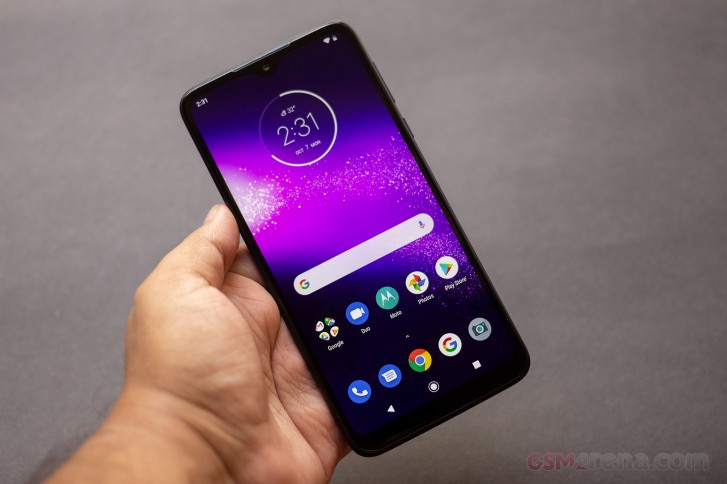
Apart from that, it's a fairly run of the mill mid-range smartphone, with a 6.2-inch 720p display, MediaTek P70 chipset with 4GB of memory and 64GB storage, 13MP main camera and a 4000mAh battery.
Motorola One Macro specs
- Body: Plastic polycarbonate, glass front, IPX2 rated
- Display: 6.2-inch, 1520x720 resolution IPS LCD, 270PPI
- Chipset: MediaTek Helio P70, 2.0GHz 4x Cortex-A53 + 4x Cortex-A73,
- Memory: 4GB RAM, 64GB storage, microSD support
- Rear cameras: 13MP f2.0 primary, 2MP f2.2 macro, 2MP f2.2 depth sensor
- Front cameras: 8MP f2.2
- Connectivity: Hybrid dual SIM, 4G LTE, 2.4GHz Wi-Fi 802.11n, Bluetooth 4.2, GPS/GLONASS/Galileo, USB-C 2.0, 3.5mm audio
- OS: Android 9 Pie
- Battery: 4000mAh, 10W charging
- Colors: Space Blue
- Misc: Fingerprint sensor, FM radio
Those who are fans of stock Android will like the fact that like the company's other phones, the One Macro also ships with stock Android out of the box. That is not to say the One Macro is an Android One device, but the software on this phone is reminiscent of older Motorola devices; stock Android but with a hint of custom software. If you liked those devices, then you are going to like the One Macro as well.
Apart from that, there's not a lot going on here. We are curious to see how that macro lens performs and if it deserves to be part of the name. But let's also find out how the rest of the phone performs.
Design
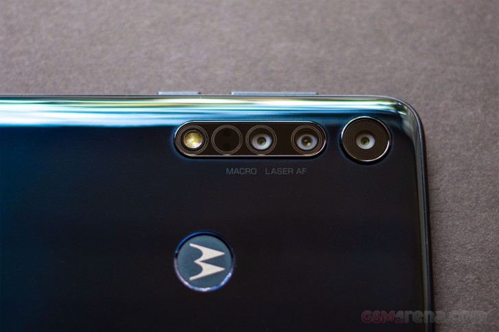
The Motorola One Macro is a pretty simple-looking phone with a now fairly standard notch-style design. The only interesting things are on the back, with a glossy gradient paint finish and a whole array of little circles within the camera module.
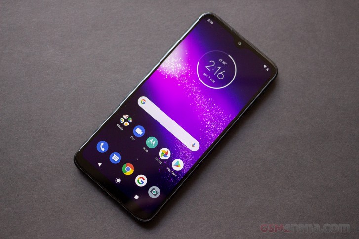
The front of the phone has fairly thick bezels surrounding the 6.2-inch LCD. The notch on the top itself isn't large but larger than average bezel above it makes it look more prominent. There's also a sizable chin at the bottom. The design doesn't look particularly premium from the front but it's not bad, either.
Along the sides, there are the volume and power buttons on the right. These are placed a bit too high for comfort, especially the volume buttons that require shuffling the device around a bit in your hand to reach. The power button has a nice knurled finish but is also a tad too high.
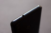
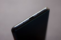
Right • Left • Top • Bottom
On top of the phone is a standard headphone jack, which is nice to see. On the left is a hybrid SIM tray that can hold two SIM cards or one SIM and one memory card. On the bottom is a standard USB-C port with a single loudspeaker.
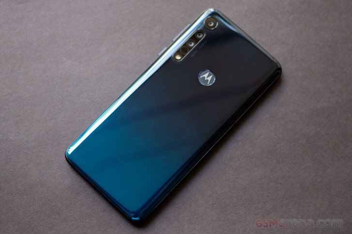
The back of the phone is where all the interesting bits are. The aforementioned paint finish looks nice, as it gradually turns a deep shade of blue towards the bottom. The Motorola logo in the middle is also a fingerprint sensor, which is a nice design touch.
Lastly, there is a cluster of camera lenses. There are actually only three cameras here, of which only two are really usable. One of them is the primary 13MP f2.0 camera and the other is the 2MP f2.2 macro lens. The third camera is a 2MP f2.2 depth sensor. The remaining two circles house the laser autofocus and the single LED flash.
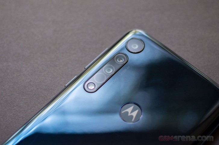
The phone is reasonably well-built overall and feels sturdy in hand despite the plastic construction. The phone is IPX2 rated and has a water-repellent design so it should be relatively safe to use out in the rain but you shouldn't dip it in water.
The plastic back cover attracts a lot of fingerprints and doesn't clean easily but it didn't attract scratches as quickly as we thought it would. It's also relatively even and doesn't look warped when light hits it, as is the case with most plastic phones with glossy back. No one will confuse this phone for a more premium one but it's perfectly fine for its class.
Display
The Motorola One Macro has a 6.2-inch, 1520x720 resolution IPS LCD with a pixel density of 270PPI and a notch at the top.
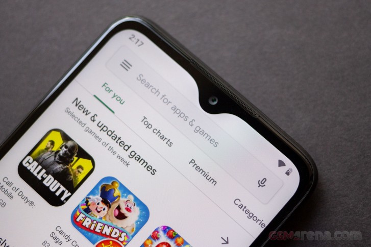
The display on the One Macro is mediocre. The biggest issue is the pixel density, which is definitely on the lower size due to the combination of large size and low resolution. You can get by most of the time with the low resolution but it's very noticeable while watching videos or looking at photos.
Battery and charging
The Motorola One Macro has a 4000mAh battery. We didn't have time to do our usual full battery life test but after a day of use the phone had only used about 40% battery, which is very impressive and should let you use the phone for about two days on a single charge.
Unfortunately, there's no fast charging on this phone and the best it can do is 10W with the supplied charger.
Camera
The Motorola One Macro has a triple camera system on the back, consisting of a 13MP main camera, 2MP macro camera and a 2MP depth sensor for portrait mode. The camera can also record 1080p video.
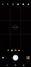
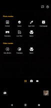
The camera application is simple but also quite functional. At the bottom of the viewfinder is an option to switch between photo and video mode. You can also find a button here to view all of your modes, which include many more options including eponymous macro mode, portrait mode, and panorama. There are also a few additional creative modes, like spot color, which lets you pick one color in the frame and every other color gets removed, and cutout, which makes a cutout of a portrait and making the background black.
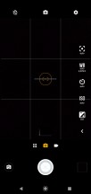
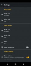
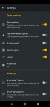
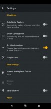
Camera app and settings
Above the viewfinder are toggles for HDR, flash, timer, and manual modes. There's also the active photo mode, which captures a small video clip before a shot is taken. The manual mode gives control over focus, white balance, ISO, and exposure. The countdown timer is also only found in manual mode and not in auto. There's no option to save images in raw format.
The image quality from the main 13MP camera is decent but not great. The colors look natural and the white balance is quite accurate. The level of detail in the images is also quite decent. However, there is a fair bit of noise in the images, especially in the shadows and the dynamic range by default isn't great. Fortunately, the HDR mode makes up for that and should really be left permanently on.


Camera samples
In low light, the image quality isn't good. Images are soft, lack detail and noisy. The focusing also suffers in the dark and we missed focus on several of the shots we took. The phone also lacks a night mode of any sort.
Now coming to the main feature of the phone, the macro lens. Right off the bat you can see the resolution is going to be a problem. At 2MP, you aren't capturing a lot of detail and while being close to the subject helps, you're not really seeing a ton more detail than cropping the 13MP image.


Macro samples
The problem with the macro lens is that the images are also not great quality. The images are quite noisy and the lack of any kind of stabilization means they often come out blurry. This is usually the result of getting the phone that close to the subject to take the picture, which often blocks out a lot of light from hitting the subject. Professional macro lenses often have a light attached to them for this reason. You could turn on the flash but it's to the right side of the macro lens while shooting and at that distance the light isn't enough to cover the entire frame, leaving you with just brightly lit right side of the frame and dark left side.
Finally, the phone can also capture 1080p video, which is of reasonably good quality. Only issues with the video are the focusing, which tends to pulse constantly, and the crop when the digital stabilization is enabled, which is quite severe.


No comments:
Post a Comment